Won on pitch while I was at eBay Marketing Solutions, for Douwe Egberts and the brands under it.
Marketing teams in a lot of different countries were all sending email under the same brand, and all building it their own way. None of it was responsive. The ask was to make the emails work on a phone, and to make sure that whichever marketer in whichever country was building the newsletter, what landed in the inbox held together.
So the work wasn’t really an email design job. It was working out what their email was made of, agreeing a set of parts, and handing over something other people could build with.
Same brand, a hundred different emails.
Every market built its own newsletters, from whatever it had to hand.
Nothing was responsive, so an email that read fine on a desktop fell apart on a phone. And because there was no shared set of parts, the brand drifted a little further with every campaign. Two emails from the same company, sent the same week from two countries, could look like they came from different places.
Nothing was built for a phone
The emails were designed for a desktop inbox. Opened on a handset they broke.
Every market started over
Teams in different countries built their own, so the same brand arrived looking different depending on where it came from.
No shared parts
There was no agreed set of blocks, so nothing anyone built could be picked up and reused by anyone else.
Consistency rested on the person
Whether a newsletter looked right came down to who happened to be building it that week.
I read between fifty and a hundred of their emails first.
Not to mark them. To find out what they were actually made of. Which blocks kept turning up, which ones only one market ever used, and where the same idea had been rebuilt five different ways by five different people. That list of recurring parts became the module set, which meant the system was built out of what they already sent rather than out of what I thought they needed.
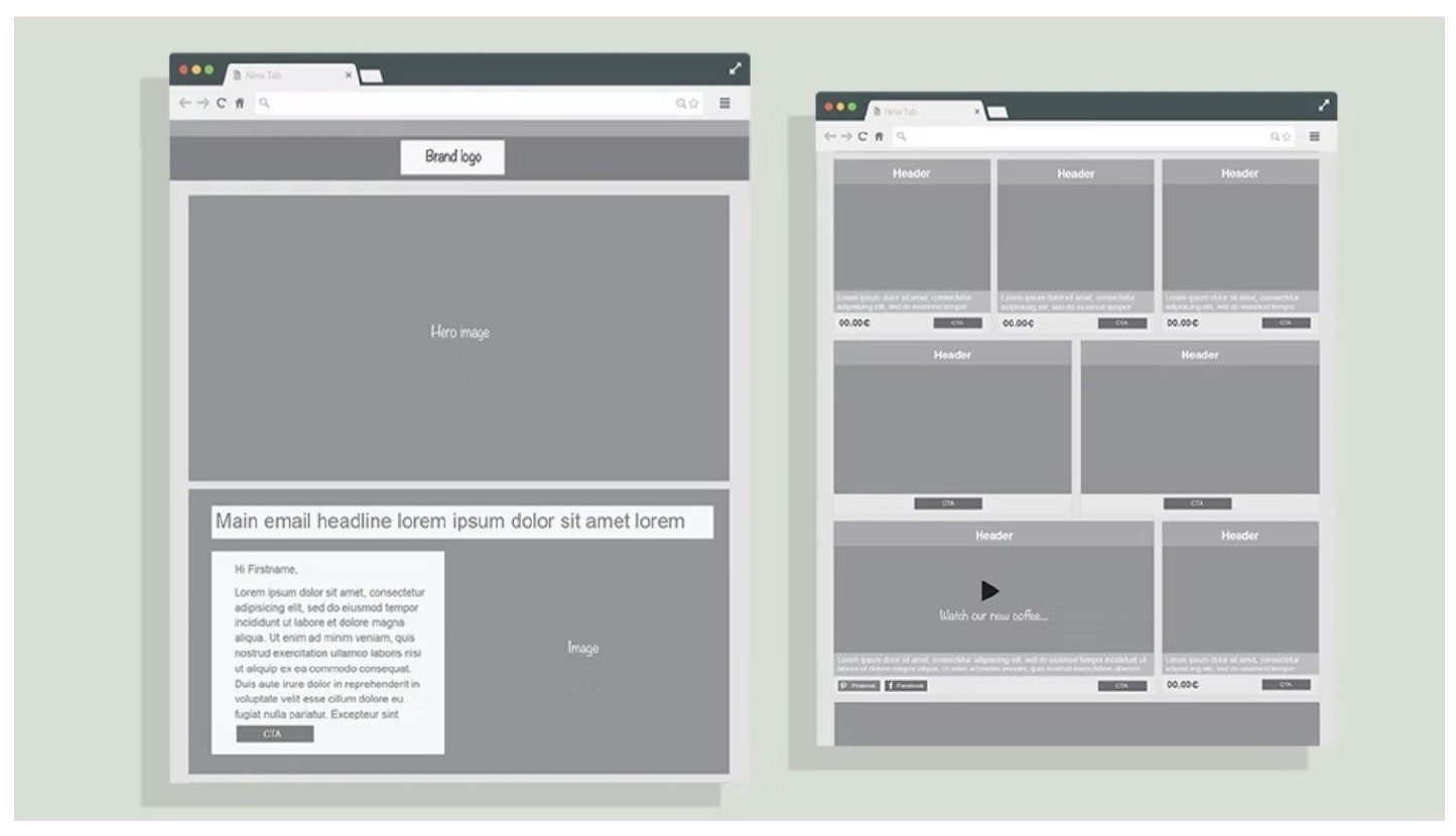
Then one master template, holding every combination of those parts.

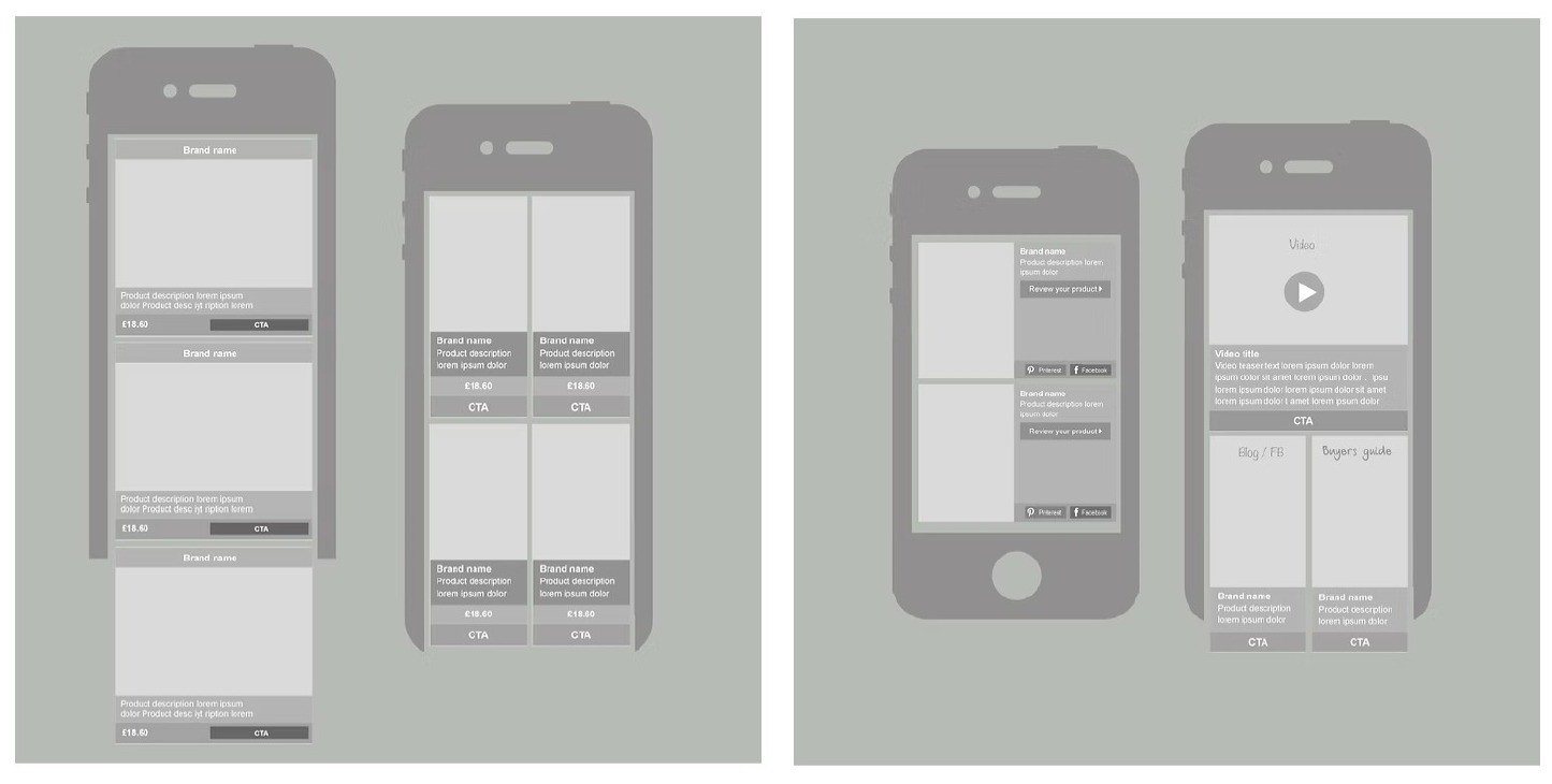
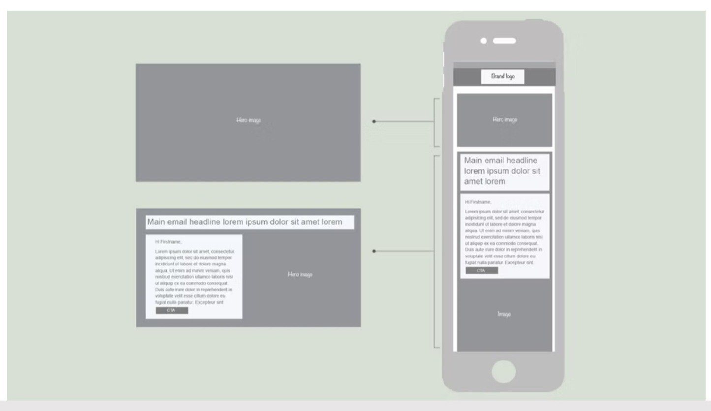
Each block had to survive the drop from desktop to phone without anyone having to think about it.
The wireframes set out how a row of three becomes a stack of three, what collapses, what stays side by side, and where the video and social blocks sit in each case. That behaviour is the part a marketer never sees and never has to.
Built out as a Senseo campaign, one of the brands under Douwe Egberts.
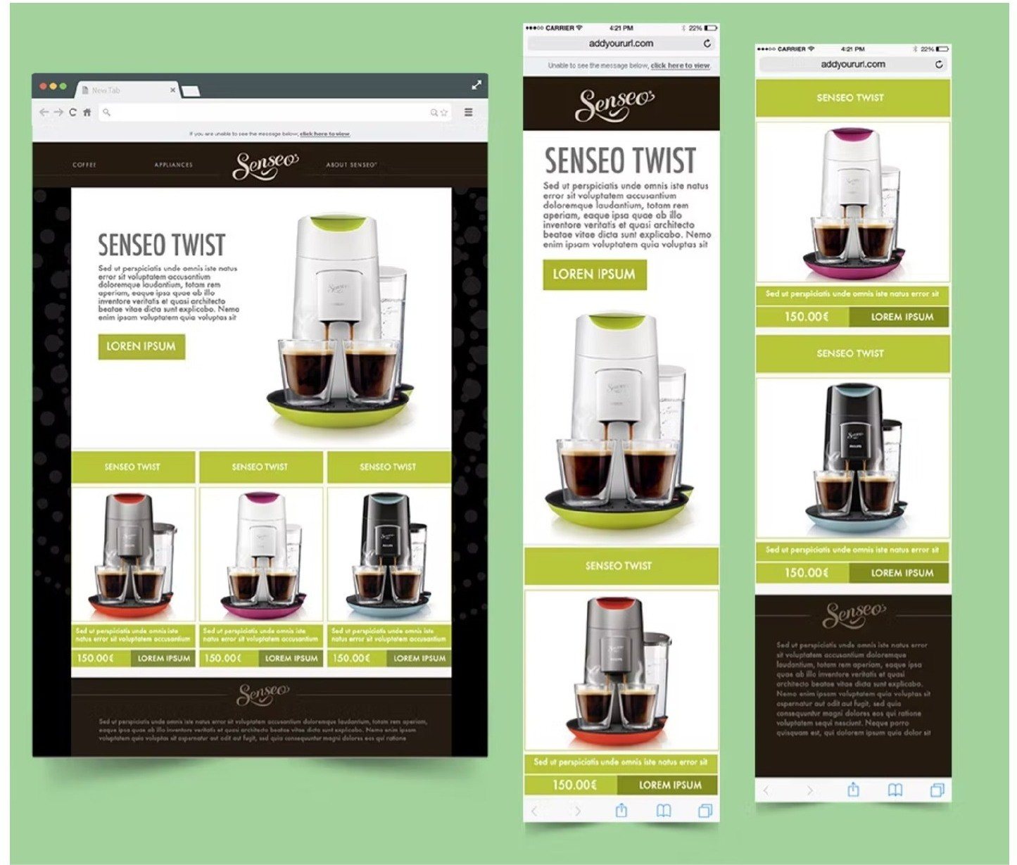
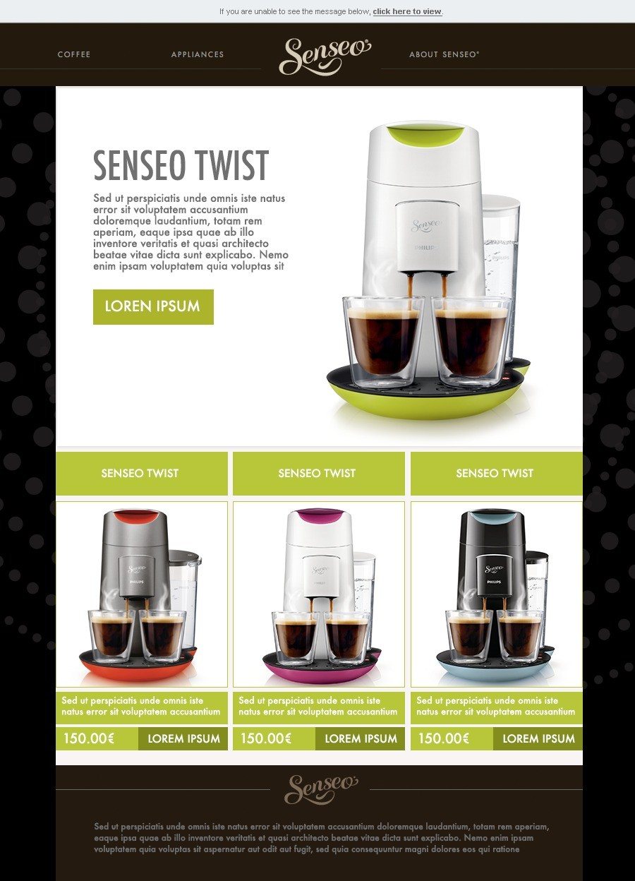

A responsive email system Douwe Egberts’ marketing teams could build from, in any market, without the brand drifting.
Three things went over: the responsive email design, the library of wireframe modules behind it, and a best practice guide explaining how the modules behave so the system could be used without me in the room.
This case study uses selected project artefacts from the design work. Client-identifiable and sensitive detail has been kept out of view.