Overview
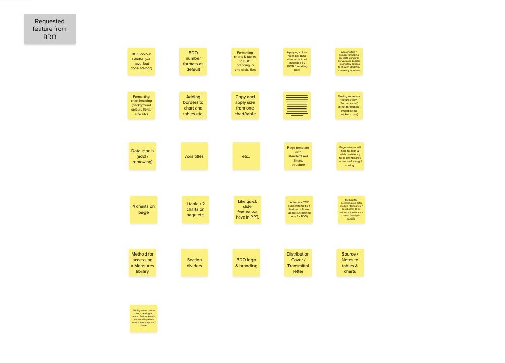
Presentation Solutions was approached by BDO to explore a Power BI plug-in that could support visualisation templates linked to complex datasets.
BDO teams were already using PSL’s Create platform to produce templated presentation content. Getting those templates into Power BI was another matter. It took real manual effort and real Power BI expertise, and plenty of the people doing it were fairly new to the tool. Work was slow and the output drifted.
I led UX and product design, working alongside front-end and back-end engineers so that what we drew stayed inside what Power BI would actually permit. Weekly check-ins with the product owner kept scope and constraints honest.
01 · The challenge
Analysis was the easy part.
People used Power BI to explore a dataset and find something worth saying. That bit worked.
Turning those analytical charts into consistent, presentation-ready output was where the time went. Building a reusable visual template asked for a level of Power BI confidence not everyone had, so few people built one. Reports drifted apart from each other, and the same formatting job got done over and over.
01
Time went on repetition
Producing the same templated output again and again ate hours that belonged to the analysis.
02
The effort was manual
Formatting a set of visuals to brand by hand is slow, and it has to be redone every time the data moves.
03
Hand-pulled data went wrong
Moving figures across by hand left room for the wrong numbers to end up in a finished report.
04
Templates needed expertise
Making a reusable template took more Power BI confidence than most users had.
01 · Problem and constraints
Designing within user, workflow and platform limits.
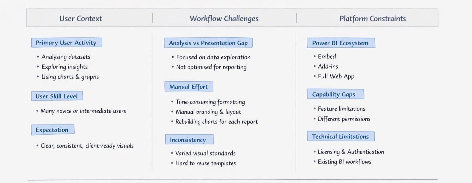
02 · Working inside the constraints
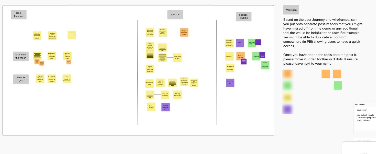
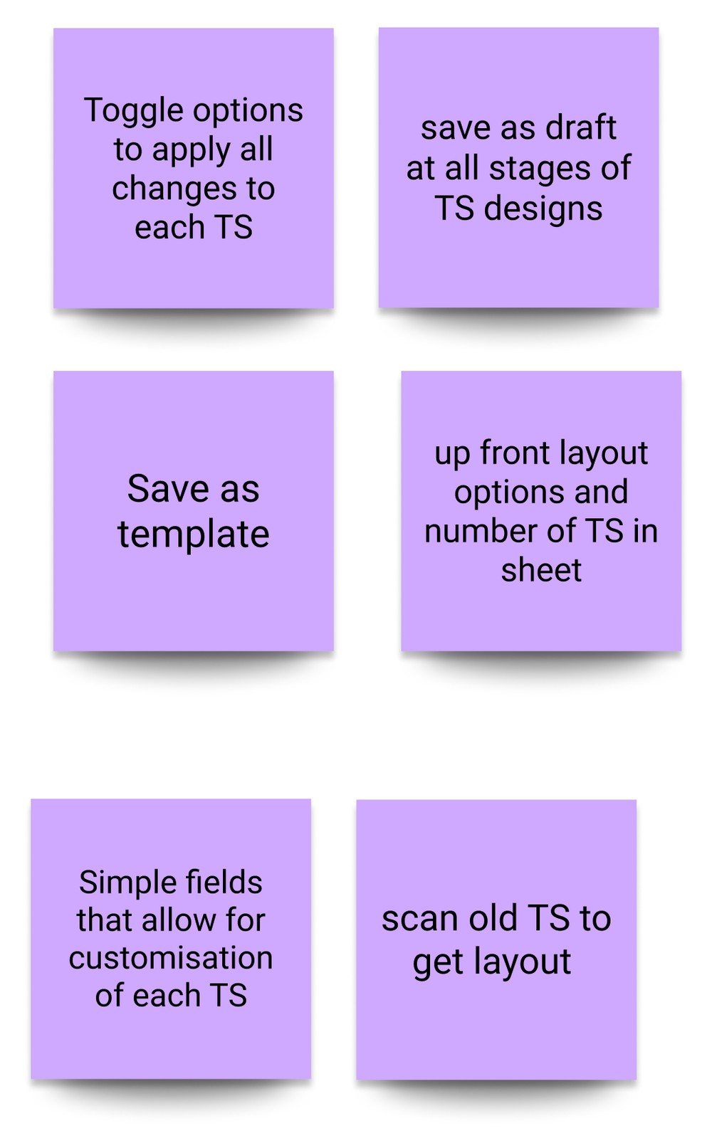
Early workshops put UX, product and engineering round the same board to work out what could realistically live inside Power BI.
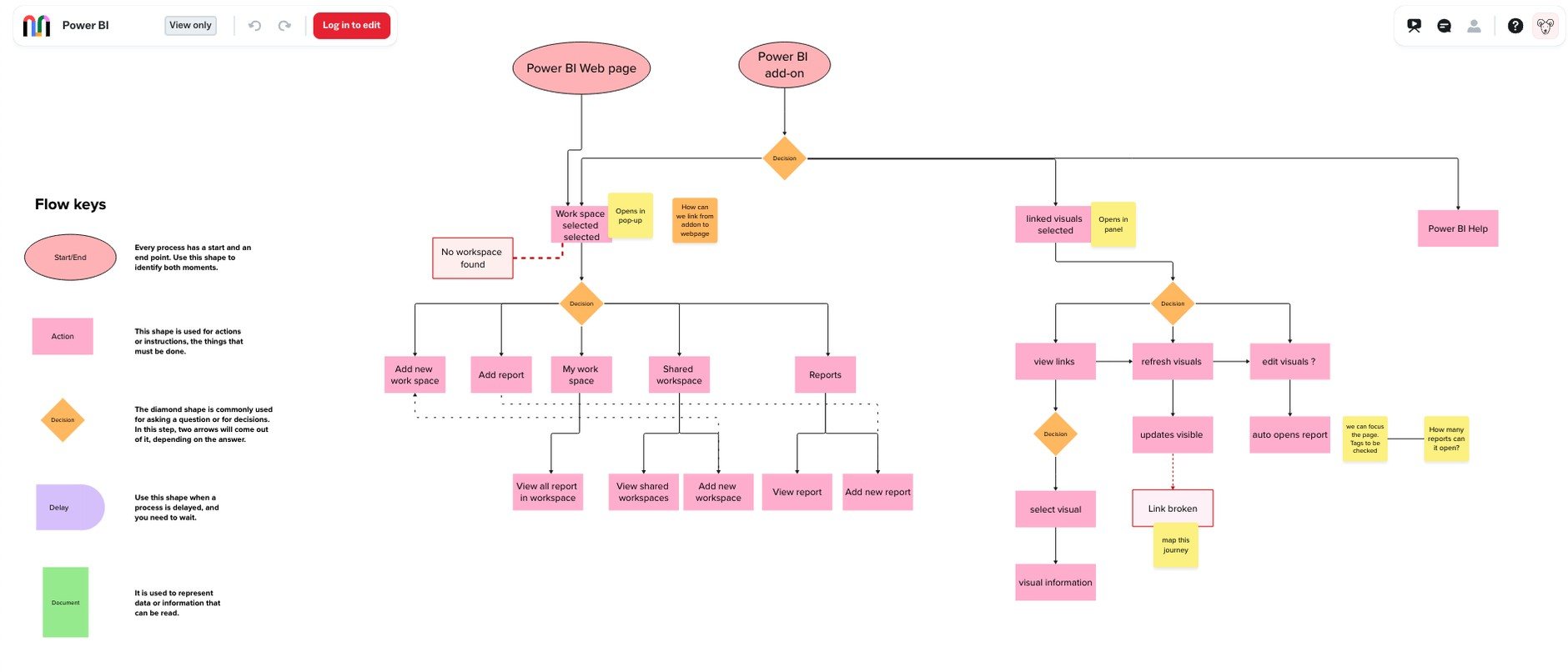
Journey mapping
Feature brainstorms
Playback sessions
In the workshops
We mapped how people move between Power BI, the add-in and the web experience, and marked every point where that movement costs them something.
03 · Shaping it
Design went back to stakeholders and engineers in regular playbacks. Not finished solutions.
Each session walked through a user journey, flagged the technical risks, and drew a line between what design had settled and what still needed investigating. It kept expectations in the same place across three teams, and it meant nobody was surprised late.
04 · Low fidelity
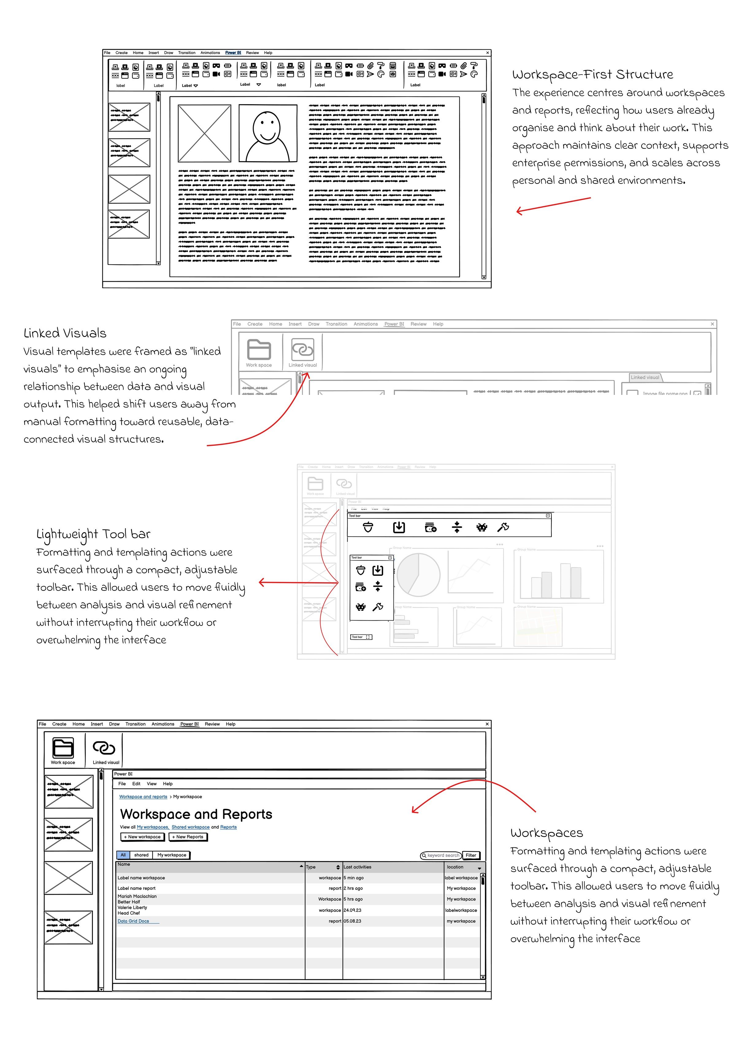
Wireframes came next, annotated so engineering could read the intent off the screen rather than ask for it.
05 · Design decisions
Make it feel like Power BI, not a new app.
01
Borrow the navigation
Use Power BI’s existing navigation, terminology and workflows, so there is nothing new to learn for people who came here to analyse data.
02
Templates as real objects
A layout should be something you save, reuse and apply across reports, not something you rebuild each time.
03
One toolbar, within reach
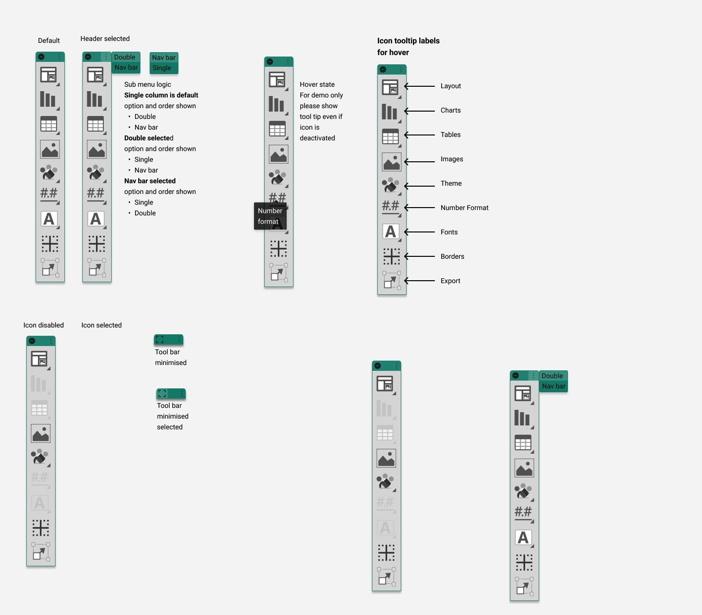
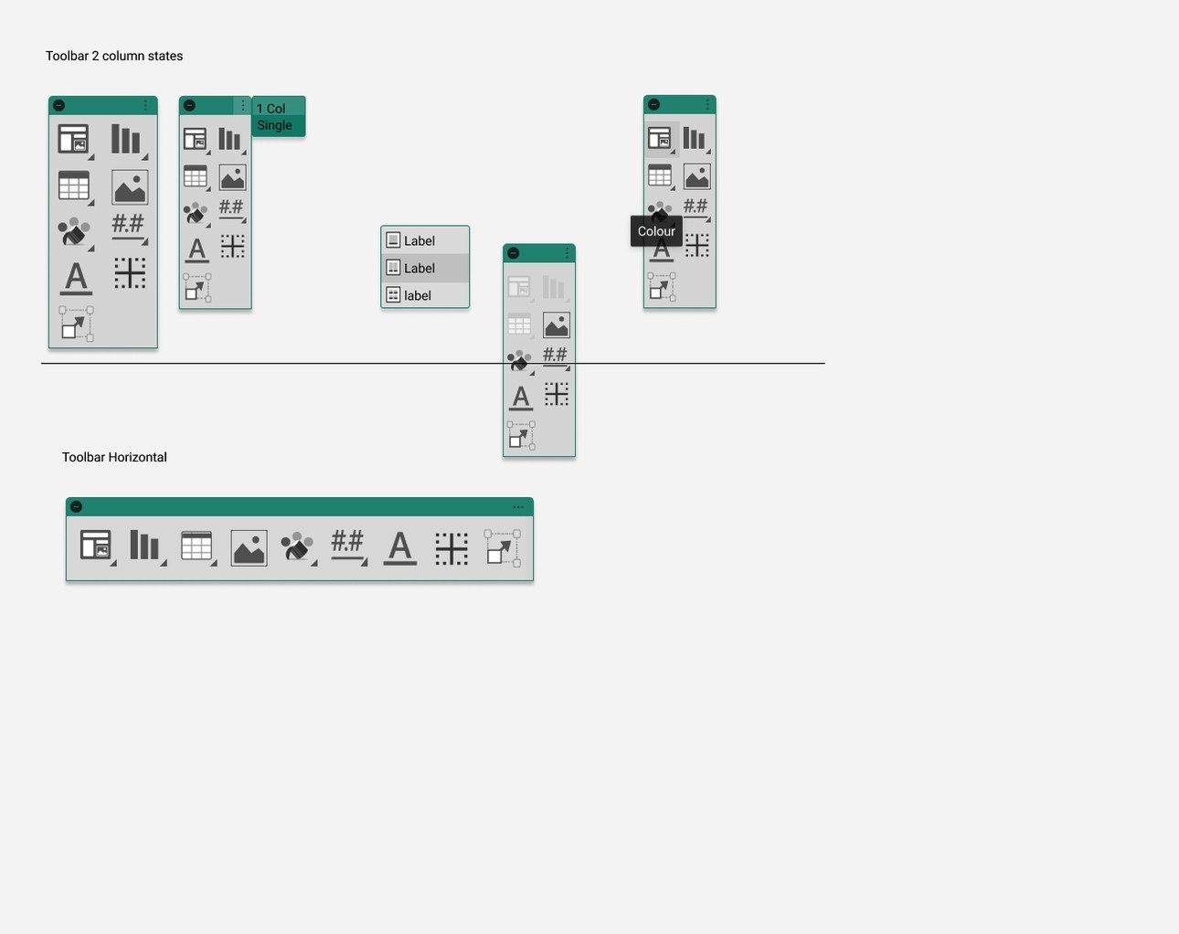
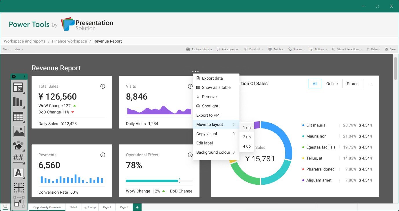
Keep the constant tools in a single toolbar that collapses out of the way when someone needs the canvas back.
04
Say when something is wrong
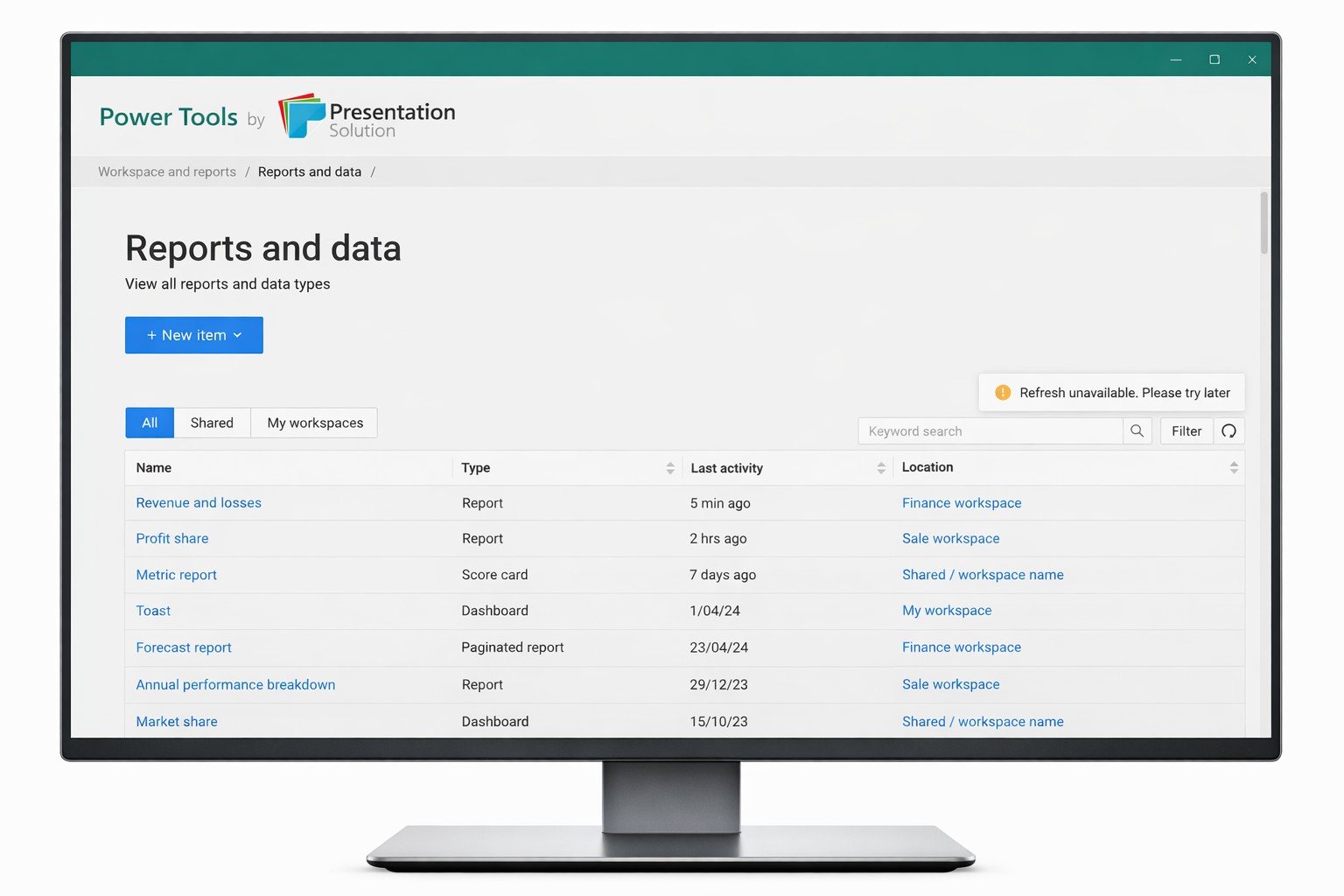
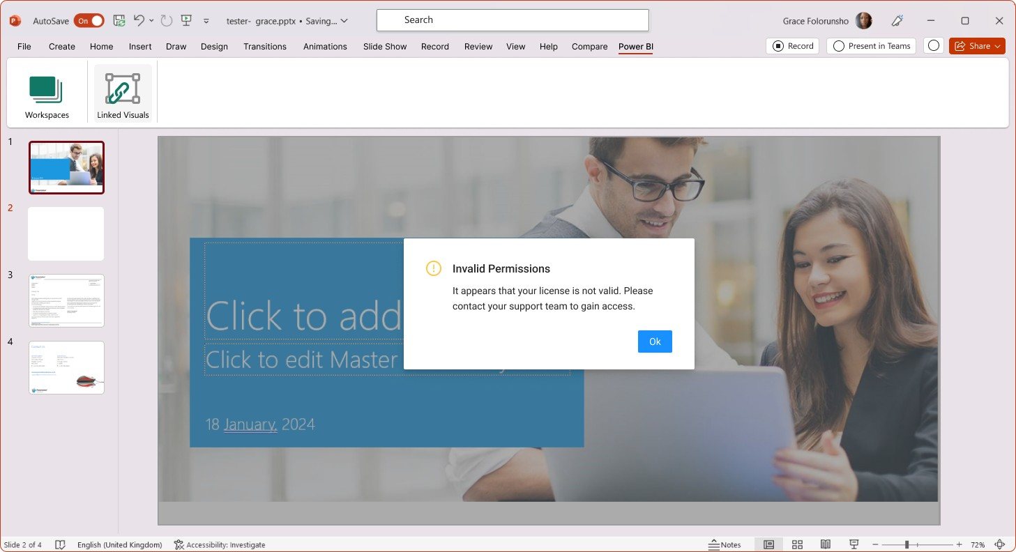
Handle the moments where a permission or a licence blocks an action, instead of letting the add-in fail quietly.
06 · Final designs
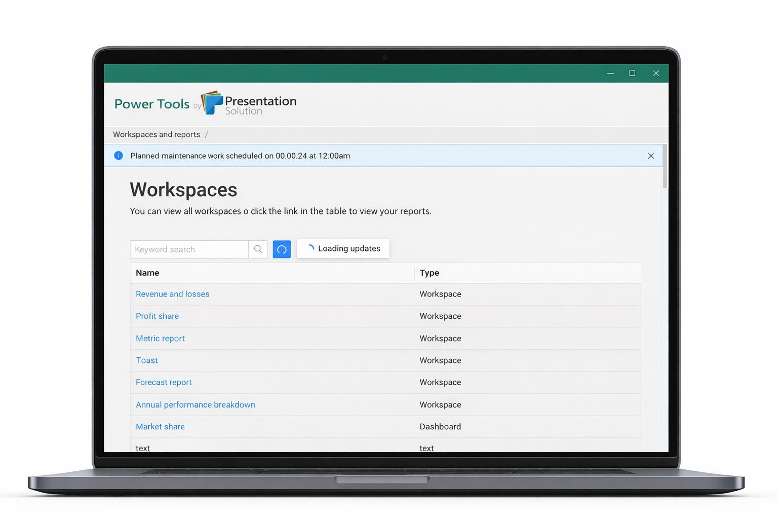
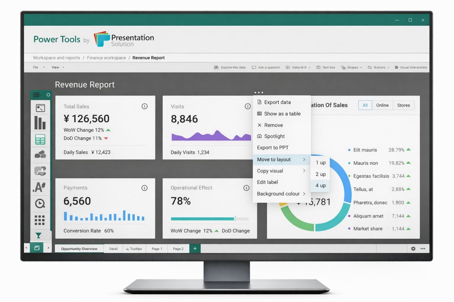
The plug-in as it ended up.
07 · Outcome
A Power BI plug-in that helps teams get from data analysis to presentation-ready visuals with less effort and more consistency.
Putting templating, layout and visual management inside Power BI supports collaboration, takes the sting out of version control, and lowers the barrier for less experienced users, while fitting the workflow people already have.
This case study uses selected project artefacts from the design work. Client-identifiable and sensitive detail has been kept out of view.