Helping hiring teams work together with less friction.
Exploring how a recruitment platform could better support collaboration between HR teams and internal hiring managers when tracking candidates through the hiring process. The goal was to simplify communication, improve visibility of candidate progress, and reduce the friction caused by fragmented tools and unclear ownership across hiring stages.
Welfound is a recruitment company that aims to rethink traditional hiring by enabling more community-driven, transparent recruitment processes.
As the platform evolved, the team identified challenges around how candidates were tracked, reviewed and communicated with across different stages of recruitment. The client wanted to streamline collaboration between hiring managers and HR teams, particularly when shortlisting candidates, managing feedback, and maintaining a shared understanding of candidate status throughout the process.
I reviewed the existing website and hiring flow, identified usability and communication gaps, and translated research insights into clear problem statements and design concepts. That meant interviewing hiring managers, co-creating personas through team workshops, mapping end-to-end process flows, facilitating ideation sessions, and playing findings and early design concepts back to stakeholders.
My role
Lead UX / UI Designer
Team
A small, cross-functional team of researchers and designers
Everyone tracked the same hire somewhere different.
The hiring process involved multiple stakeholders, each using different tools and mental models to track candidate progress.
That resulted in fragmented communication, duplicated effort and a lack of shared visibility across recruitment stages. The process was time-consuming, and important context was often lost between handovers. The challenge was to design a solution that improved alignment and transparency across teams, while fitting naturally into existing recruitment workflows and avoiding additional complexity for already time-poor users.
01
Communication was fragmented
HR teams and internal hiring managers worked in separate tools, so no one held a single reliable view of where a candidate stood.
02
Effort was duplicated
The same information was gathered, chased and re-entered by different people at different stages of the process.
03
Judgement stopped at the CV
Hiring managers found it difficult to assess candidates beyond CVs, with little richer context to draw on.
04
Feedback lost its timing
HR teams struggled to keep feedback timely and consistent, and context was often lost between handovers.
02 · Building the evidence
The project began with discovery research, including generative interviews with experienced hiring managers working in the tech industry.
01
Generative interviews
02
Affinity mapping
03
Personas and journey mapping
04
Concept testing
Who we spoke to
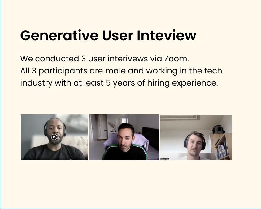
We started with the people doing the hiring, not the platform. And specifically with people who hire often enough to have built their own workarounds.
Three remote interviews with hiring managers in tech. Each had at least five years of hiring behind them.View full size
03 · Synthesis
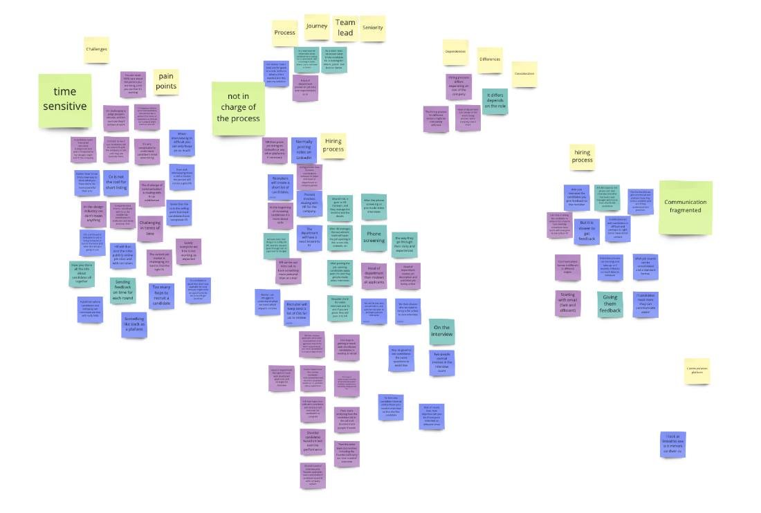
Insights from the interviews were synthesised through affinity mapping, which surfaced the behaviours, motivations and frustrations people shared.
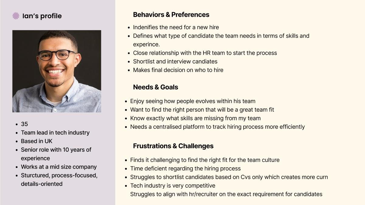
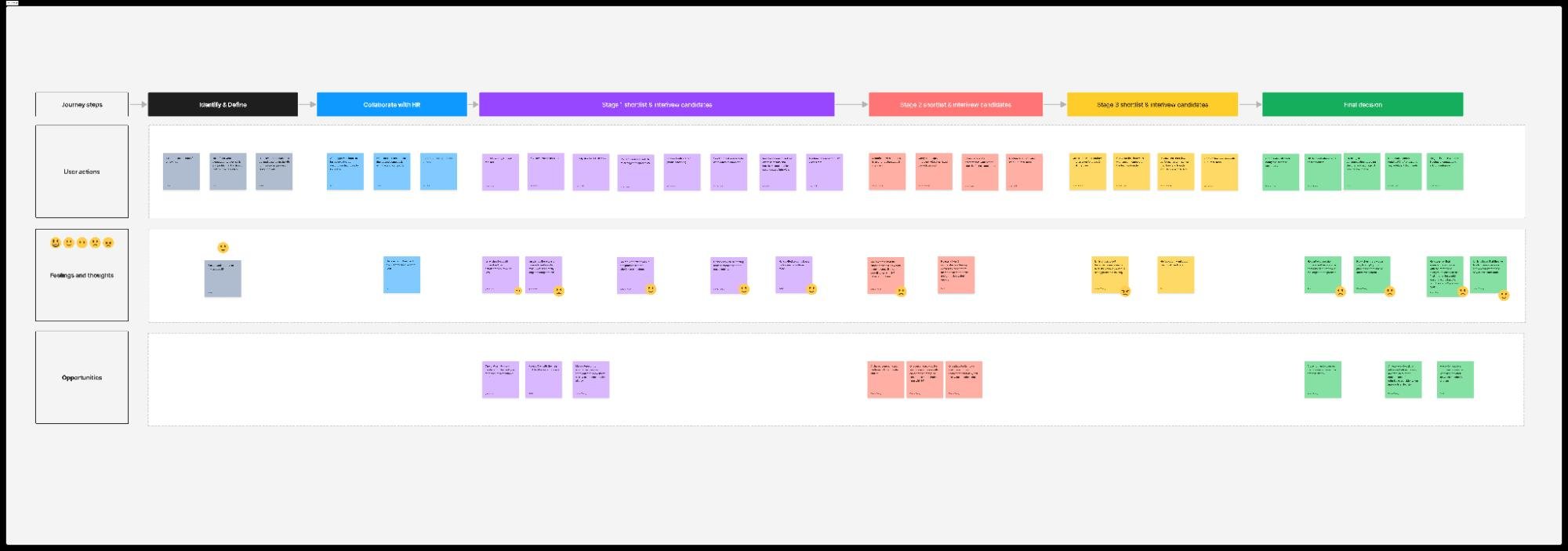
We then collaboratively created user personas and mapped the existing hiring journey, capturing user actions, thoughts, emotions and opportunity areas across each stage. That shared artefact became a key alignment tool within the team and helped ground design decisions in real user needs.
Interview notes clustered into themes. Time pressure, fragmented communication and a sense of not owning the process kept coming back.View full size
Ian, the team-lead persona we built from the interviews. He hires for his own team, never has enough time, and can’t tell much from a CV.View full size
End-to-end hiring journey mapDrag to explore →
Drag to move around it. The map carries actions, thoughts, emotions and opportunity areas for every stage of a hire.View full size
04 · Framing the problem
Before sketching anything, we wrote down the problem in one sentence and agreed it as a team.
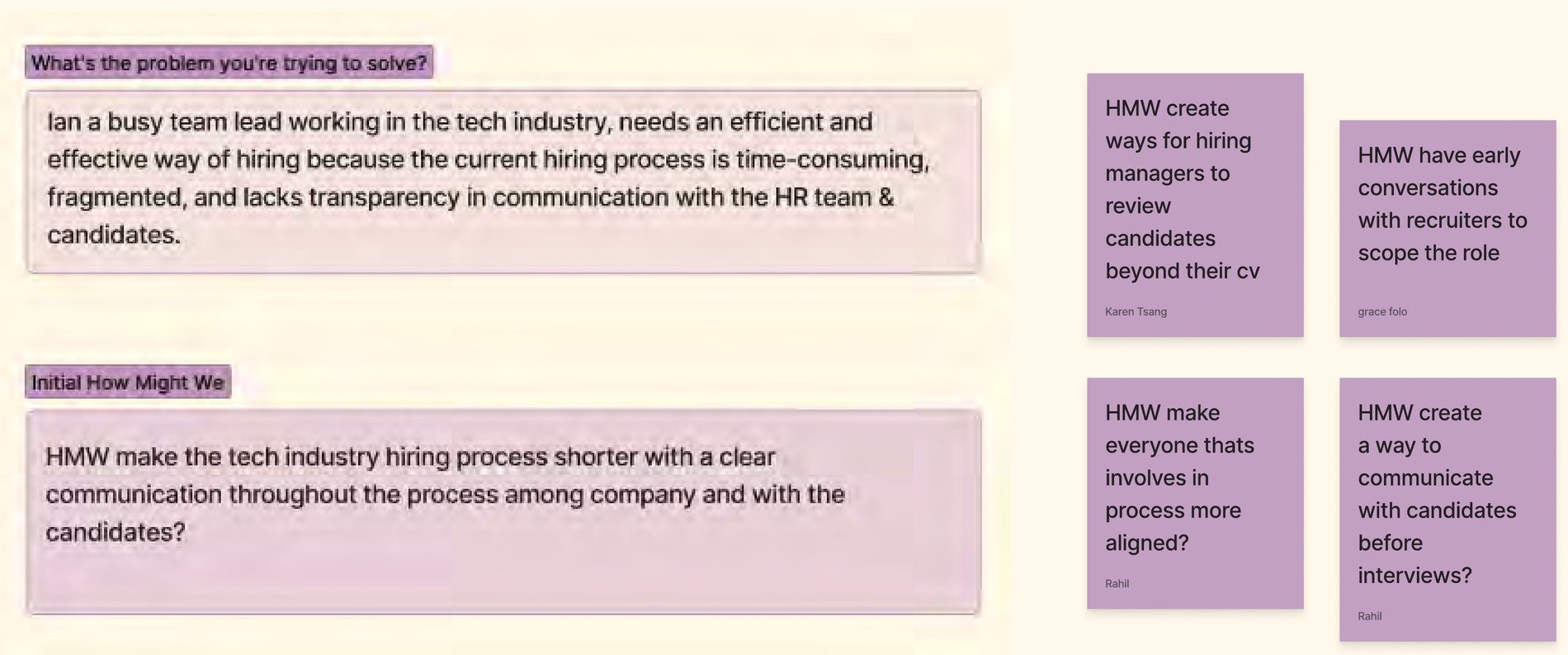
Ian, a busy team lead working in the tech industry, needs an efficient and effective way of hiring, because the current hiring process is time-consuming, fragmented, and lacks transparency in communication with the HR team and candidates.Agreed problem statement
That became one How Might We: how might we make hiring in tech shorter, with clear communication inside the company and with candidates? The team broke it into four smaller ones. Reviewing people beyond their CV. Scoping the role with recruiters earlier. Keeping everyone involved aligned. Talking to candidates before the interview.
The board where we agreed the problem statement and the How Might We prompts. Until it was written down, we’d each been solving a slightly different problem.View full size
What they were working with
The starting point was a board and a wall of templates.
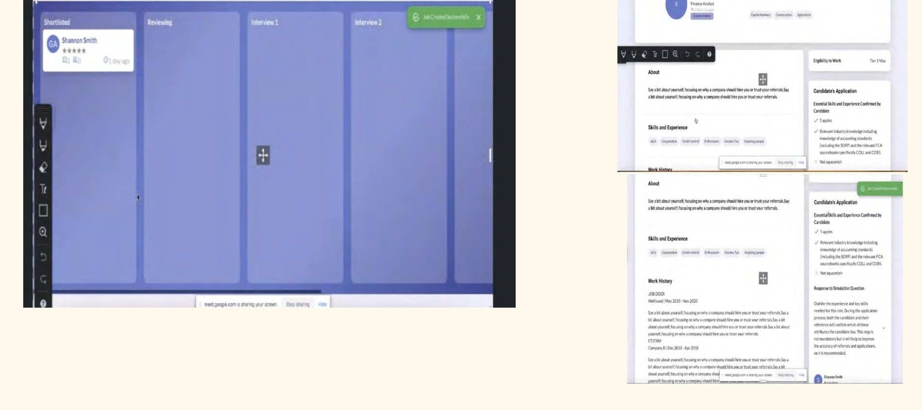
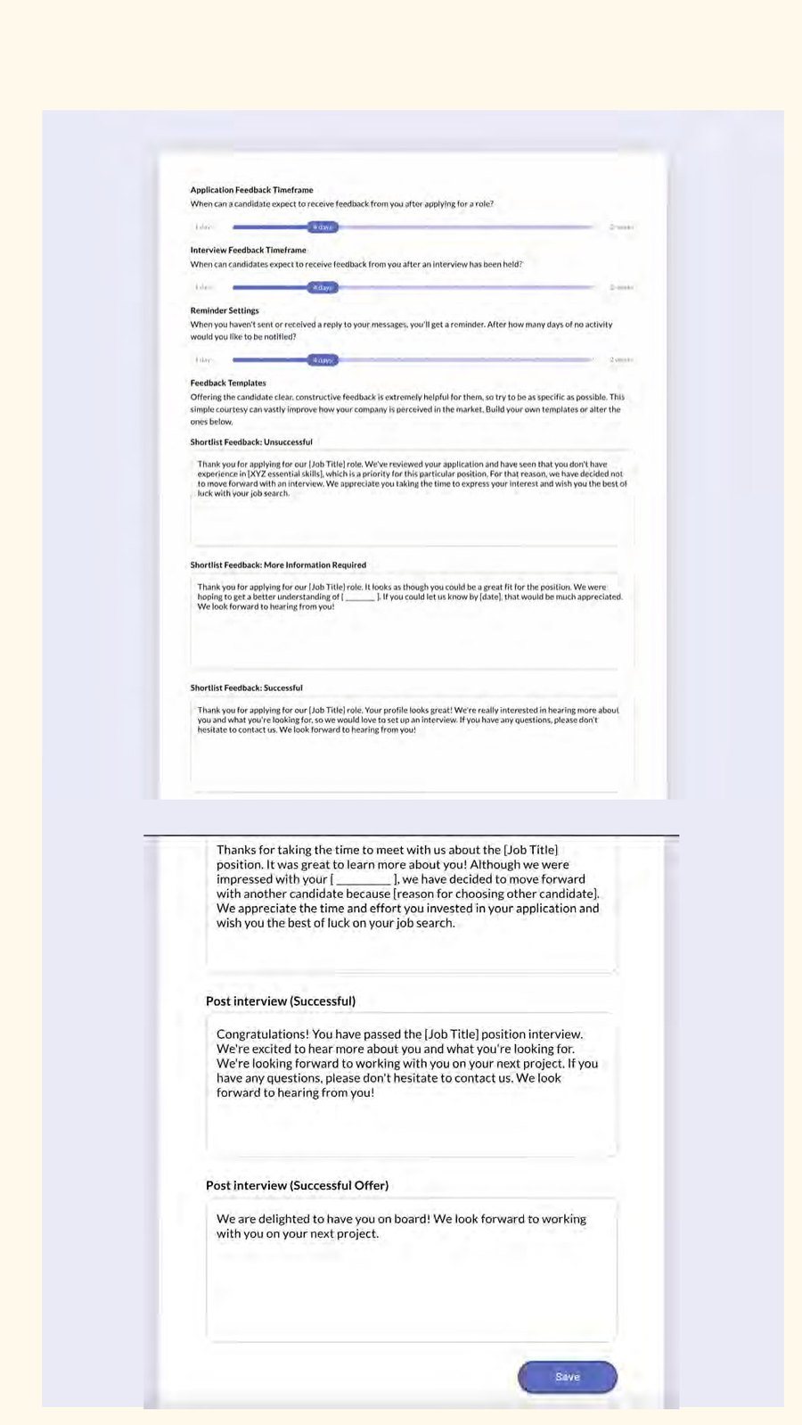
The original board and candidate profile. The columns told you where someone was. For anything else about them you had to go looking.View full sizeCommunication setup was one long scroll of templates and timings. Nothing showed you what a candidate would actually receive.View full size
05 · Concepts and testing
Design concepts were explored through low-fidelity sketches and wireframes, followed by concept testing sessions with hiring managers.
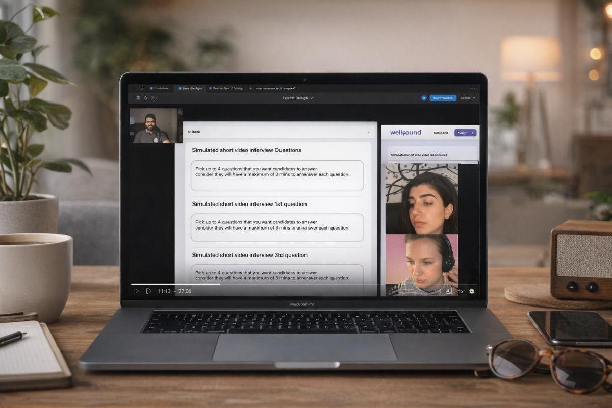
The simulated short-video interview in testing. Candidates answer up to four set questions on camera, three minutes each, so there’s something to go on besides the CV.View full size
Feedback from these sessions informed iterations and highlighted the places where clarity, hierarchy and guidance were needed most.
“It looks like Trello, so I’m already used to how it works.”
Deepak · Senior product manager
“The tags are quite small, and they’re for different types of info yet look the same and sit at the same hierarchy — that makes them hard to digest.”
Deepak · Senior product manager
“Is there any part where I can check the profile with a team member?”
Dalma · Design team lead
06 · Design direction
Everything about a hire, on one screen.
01
A dashboard at the centre
Give hiring managers a clear overview of candidates across stages, reducing the need to switch between tools or rely on external notes.
02
More than a CV
Design candidate profiles to surface soft skills, structured feedback and richer context in a scannable format.
03
Conversations with a home
Make communication explicit and contextual, so people understand where a conversation lives and who can see it.
04
Progressive disclosure
Keep the interface approachable while still supporting detailed review when someone needs to go deeper.
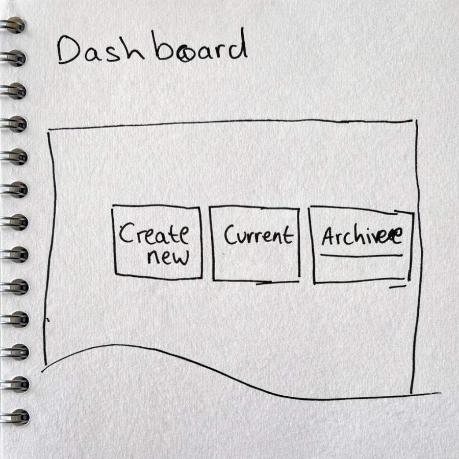
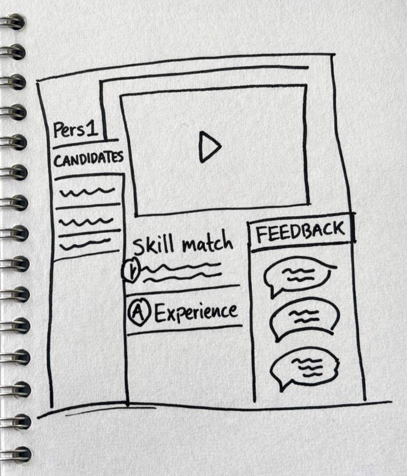
Early sketches. The dashboard splits hiring into new, current and archived. The profile pulls video, skill match, experience and feedback onto one page.View full size
07 · Final designs
What it looked like by the end.
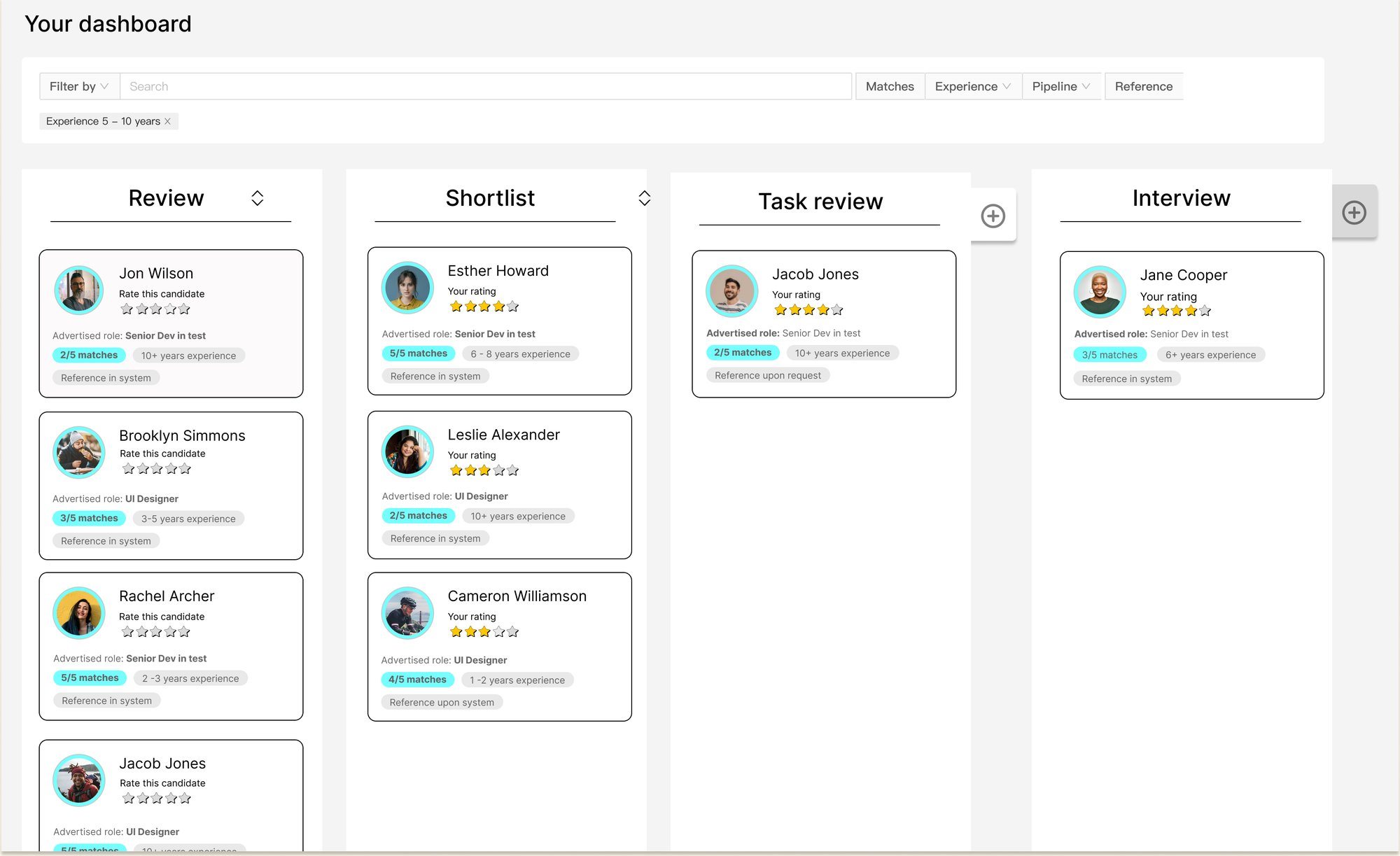
Testers kept comparing this to Trello. That was the point: nobody had to learn it. What’s new sits on the cards — skill match, years of experience, whether a reference is already on file, and a rating anyone reviewing can leave.View full size
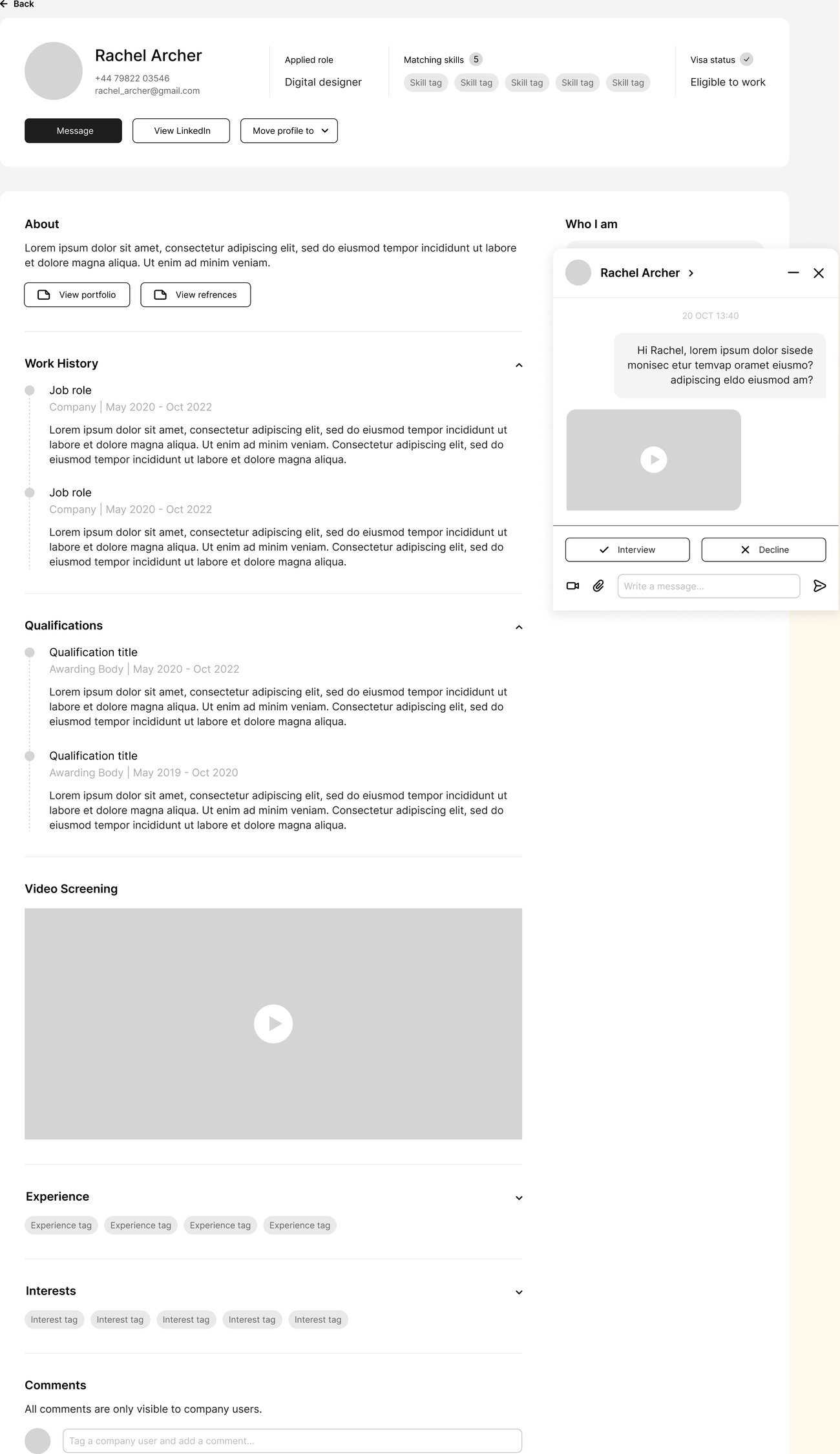
This is the screen that goes past the CV. Work history and qualifications are still here. So is a video screening, a “Who I am” column, and a comment thread only people inside the company can see.View full size
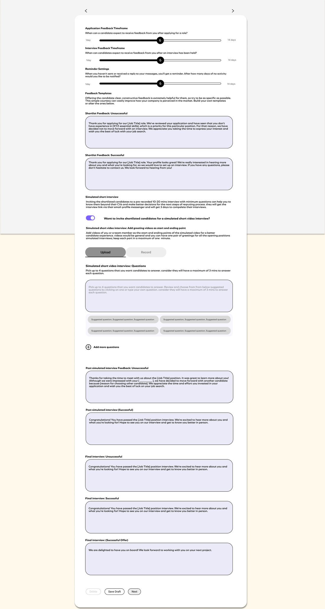
Rebuilt around what the candidate receives, and when. Feedback timeframes, reminders, an editable template for each outcome, and the questions for the video interview.View full size
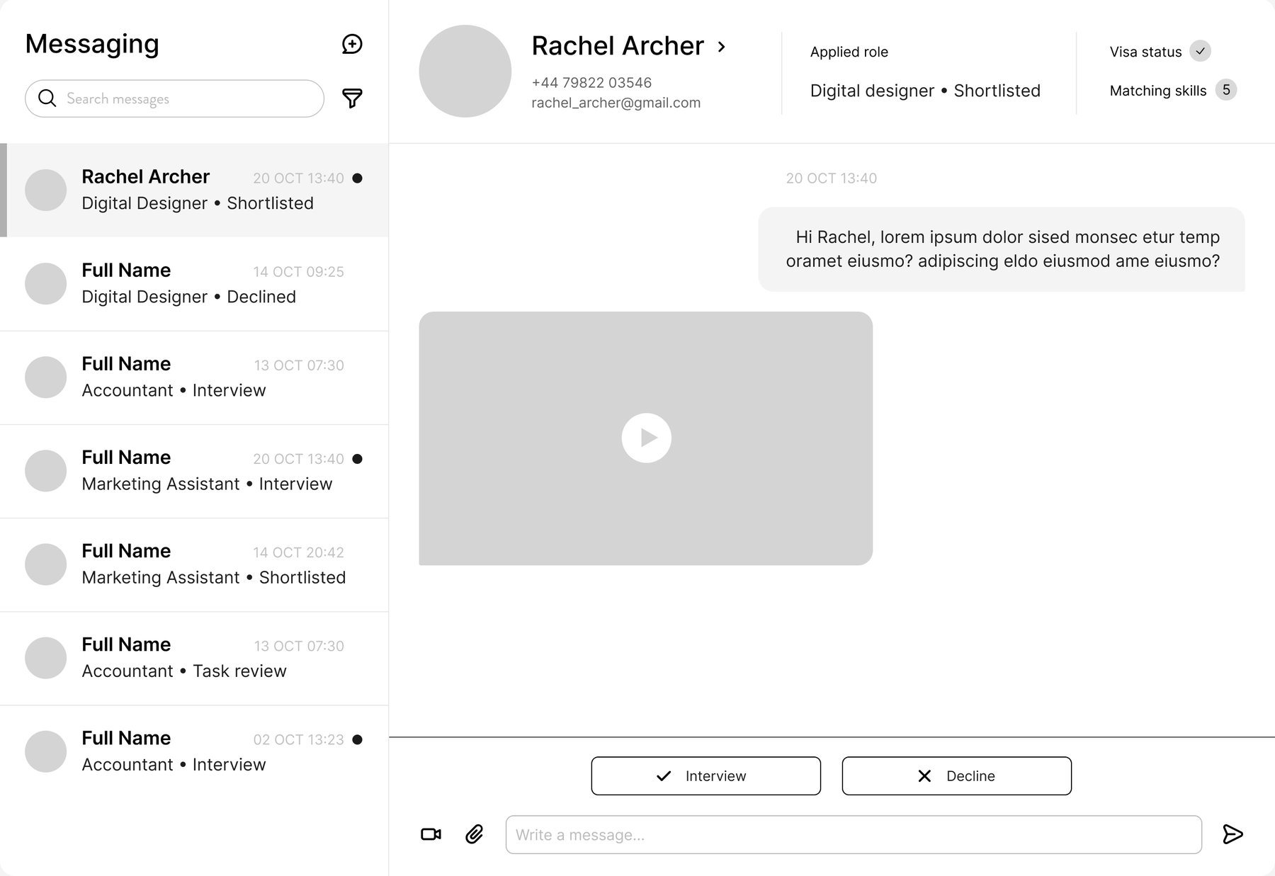
Messages live next to the candidate, not in a separate inbox. Every conversation carries the role and the stage it belongs to.View full size
08 · Outcome
A validated design concept for a recruitment platform that supports clearer collaboration between HR teams and hiring managers.
The proposed solution improved visibility of candidate progress, simplified communication, and enabled more informed decision-making throughout the hiring journey.
This case study uses selected project artefacts from the design work. Client-identifiable and sensitive detail has been kept out of view.